ProgressStepper
ProgressStepper in itself gets all the necessary details from ProgressStepperProvider. This helps to avoid passing same props to each screen.
In terms of single page usage, it doesn't provide much benefit but for multi page usage, this keeps the codebase clean.
Use this to simply indicate where the ProgressStepper should appear in a screen.
Example Usage
function HomeScreen({ navigation }) {
  return (
    <View style={styles.container}>
      <ProgressStepper />
      <Button onPress={() => navigation.navigate("Cart")} title="Go To cart" />
    </View>
  );
}
ProgressStepperProvider
Progress stepper provider is a Context Provider that holds all of the styles and states of ProgressStepper.
This makes it possible to declare styles in one place and have it applied in every screen progress stepper is used.
Single Page
Usage
Declare ProgressStepperProvider in root level to use ProgressStepper and access useProgressStepperContext hooks
App.js
import { ProgressStepperProvider } from "react-native-reanimated-progress-steps";
import ProgressStepperExample from "./ProgressStepperExample";

export default function App() {
  return (
    <ProgressStepperProvider>
      <ProgressStepperExample />
    </ProgressStepperProvider>
  );
}
ProgressStepperExample.js
import {
  ProgressStepper,
  useProgressStepperContext,
} from "react-native-reanimated-progress-steps";

const ProgressStepperExample = () => {
  const { goToNext, goToPrevious } = useProgressStepperContext();

  return (
    <View style={styles.container}>
      <ProgressStepper />
      <Button title="Previous" onPress={goToPrevious} />
      <Button title="Next" onPress={goToNext} />
    </View>
  );
};

export default ProgressStepperExample;
Default Styles
extended mode and width set to full screen
<ProgressStepperProvider width={Dimensions.get('window').width} extended>
Round progress steps with stepStyle and innerLabelStyle
In the default diamond shapes, the inner label styles are rotated to -45 deg to match the style. So to override, simply use stepStyle and innerLabelStyle together.
<ProgressStepperProvider
  width={Dimensions.get('window').width}
  extended
  stepStyle={{
    height: 30,
    width: 30,
    borderRadius: 15,
    justifyContent: 'center',
    alignItems: 'center',
  }}
  innerLabelStyle={{
    color: 'white',
    fontWeight: 'bold',
  }}
  trackActiveColor="green"
  activeColor="green"
>
renderInnerStep to render any valid component as steps
In the default diamond shapes, the inner step styles are rotated to match the style. So to override, simply use stepStyle and renderInnerStep together.
<ProgressStepperProvider
        width={Dimensions.get('window').width}
        extended
        renderInnerStep={() => {
          return <Image source={require('./checkbox.png')} />;
        }}
        stepStyle={{
          width: 30,
          height: 30,
          borderRadius: 15,
          justifyContent: 'center',
          alignItems: 'center',
          backgroundColor: '#E44949',
        }}
        activeColor="#E44949"
        trackActiveColor="#E44949"
        trackHeight={2}
      >
Multi Page
Setup
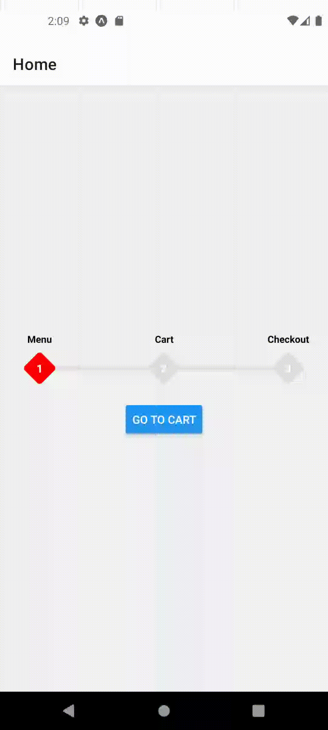
Let's assume we have a simple stack navigator in our app with Home, Cart and Checkout Screens.
Each screen has a button that navigates to the next screen. Our goal is to animate the ProgressStepper steps automatically as we navigate to or away between these pages.
First, let's wrap our Stack Navigator with ProgressStepperProvider so that we can use ProgressStepper in each screen.
App.js
import React from 'react';
import { View, StyleSheet, Button } from 'react-native';
import { NavigationContainer } from '@react-navigation/native';
import {
  createNativeStackNavigator
} from '@react-navigation/native-stack';

import {
  ProgressStepperProvider,
  ProgressStepper
} from 'react-native-reanimated-progress-steps';


function HomeScreen({ navigation }) {

  return (
    <View style={styles.container}>
      <ProgressStepper />
      <Button onPress={() => navigation.navigate('Cart')} title="Go To cart" />
    </View>
  );
}

function CartScreen({ navigation }) {

  return (
    <View style={styles.container}>
      <ProgressStepper />
      <Button
        onPress={() => navigation.navigate('Checkout')}
        title="Go To checkout"
      />
    </View>
  );
}

function CheckoutScreen({ navigation }) {
  return (
    <View style={styles.container}>
      <ProgressStepper />
      <Button onPress={() => navigation.navigate('Home')} title="Go To Home" />
    </View>
  );
}


const Stack = createNativeStackNavigator<RootStackParamList>();

function App() {
  return (
    <NavigationContainer>
      <ProgressStepperProvider>
        <Stack.Navigator>
          <Stack.Screen name="Home" component={HomeScreen} />
          <Stack.Screen name="Cart" component={CartScreen} />
          <Stack.Screen name="Checkout" component={CheckoutScreen} />
        </Stack.Navigator>
      </ProgressStepperProvider>
    </NavigationContainer>
  );
}

export default App;

const styles = StyleSheet.create({
  container: {
    flex: 1,
    justifyContent: 'center',
    alignItems: 'center',
    gap: 16,
  },
});
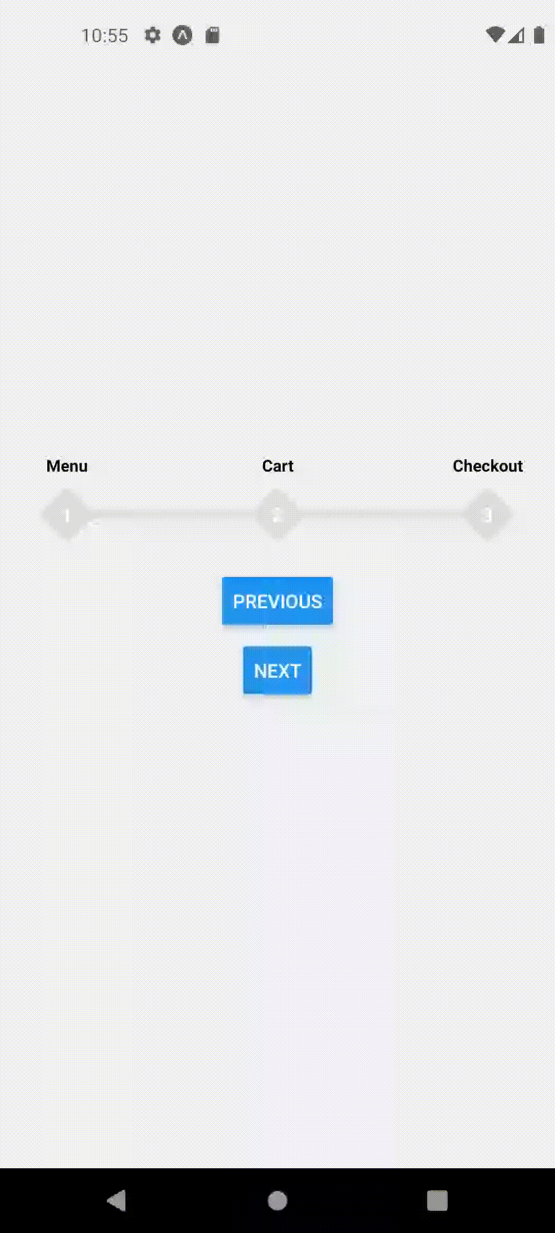
Now you may notice that we can navigate between these pages and our ProgressStepper component shows up but the steps do not change!
In order for the steps to change automatically, let's write a hook that tells ProgressStepper to change steps whenever a new screen is in focus.
useFocusedPosition.js
import React, { useEffect } from "react";
import { useProgressStepperContext } from "react-native-reanimated-progress-steps";
import { useIsFocused } from "@react-navigation/native";

export default function useFocusedPosition(position) {
  const isFocused = useIsFocused();
  const { setCurrentPosition } = useProgressStepperContext();
  useEffect(() => {
    if (isFocused) {
      setCurrentPosition(position);
    }
  }, [isFocused, setCurrentPosition, position]);
}
Note that, this hook takes a position as a number, and sets the current step position to that number whenever that screen is in focus.
Now, all that we need to do is call this hook with our desired position on each screen.
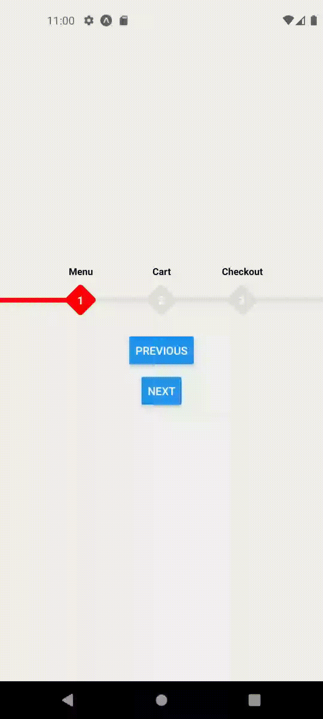
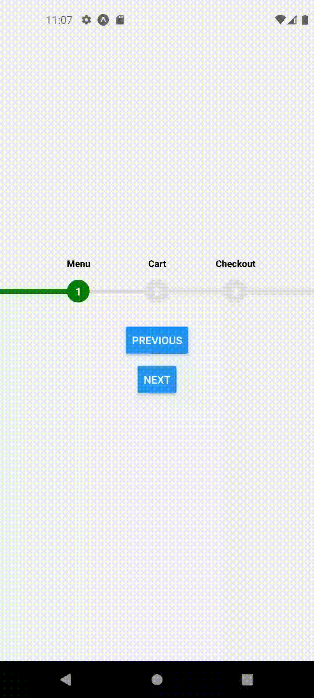
For example, Home screen should represent Step 1 so we will call useFocusedPosition(1) inside HomeScreen
function HomeScreen({ navigation }) {
  useFocusedPosition(1);
  return (
    <View style={styles.container}>
      <ProgressStepper />
      <Button onPress={() => navigation.navigate("Cart")} title="Go To cart" />
    </View>
  );
}
Similarly, for other screens we will call this hook with their respective step numbers.
function CartScreen({ navigation }) {
  useFocusedPosition(2);
  return (
    <View style={styles.container}>
      <ProgressStepper />
      <Button
        onPress={() => navigation.navigate("Checkout")}
        title="Go To checkout"
      />
    </View>
  );
}

function CheckoutScreen({ navigation }) {
  useFocusedPosition(3);
  return (
    <View style={styles.container}>
      <ProgressStepper />
      <Button onPress={() => navigation.navigate("Home")} title="Go To Home" />
    </View>
  );
}
Summary
In summary, to go from a simple single page setup, where we could change the steps manually or via button clicks, to an automatically changing multi page stepper, we had to do the following -
- Declare a custom hook to change the position dynamically
- Call the hook with appropriate position on each screen
Boilerplate
To create this same setup. Create App.js and useFocusedPostion.js with the following code to get started quickly.
App.js
import React from 'react';
import { View, StyleSheet, Button } from 'react-native';
import { NavigationContainer } from '@react-navigation/native';
import {
  createNativeStackNavigator
} from '@react-navigation/native-stack';

import {
  ProgressStepperProvider,
  ProgressStepper
} from 'react-native-reanimated-progress-steps';
import useFocusedPosition from './useFocusedPosition';

function HomeScreen({ navigation }) {
  useFocusedPosition(1);
  return (
    <View style={styles.container}>
      <ProgressStepper />
      <Button onPress={() => navigation.navigate("Cart")} title="Go To cart" />
    </View>
  );
}

function CartScreen({ navigation }) {
  useFocusedPosition(2);
  return (
    <View style={styles.container}>
      <ProgressStepper />
      <Button
        onPress={() => navigation.navigate("Checkout")}
        title="Go To checkout"
      />
    </View>
  );
}

function CheckoutScreen({ navigation }) {
  useFocusedPosition(3);
  return (
    <View style={styles.container}>
      <ProgressStepper />
      <Button onPress={() => navigation.navigate("Home")} title="Go To Home" />
    </View>
  );
}

const Stack = createNativeStackNavigator<RootStackParamList>();

function App() {
  return (
    <NavigationContainer>
      <ProgressStepperProvider>
        <Stack.Navigator>
          <Stack.Screen name="Home" component={HomeScreen} />
          <Stack.Screen name="Cart" component={CartScreen} />
          <Stack.Screen name="Checkout" component={CheckoutScreen} />
        </Stack.Navigator>
      </ProgressStepperProvider>
    </NavigationContainer>
  );
}

export default App;

const styles = StyleSheet.create({
  container: {
    flex: 1,
    justifyContent: 'center',
    alignItems: 'center',
    gap: 16,
  },
});
useFocusedPosition.js
import React, { useEffect } from "react";
import { useProgressStepperContext } from "react-native-reanimated-progress-steps";
import { useIsFocused } from "@react-navigation/native";

export default function useFocusedPosition(position) {
  const isFocused = useIsFocused();
  const { setCurrentPosition } = useProgressStepperContext();
  useEffect(() => {
    if (isFocused) {
      setCurrentPosition(position);
    }
  }, [isFocused, setCurrentPosition, position]);
}
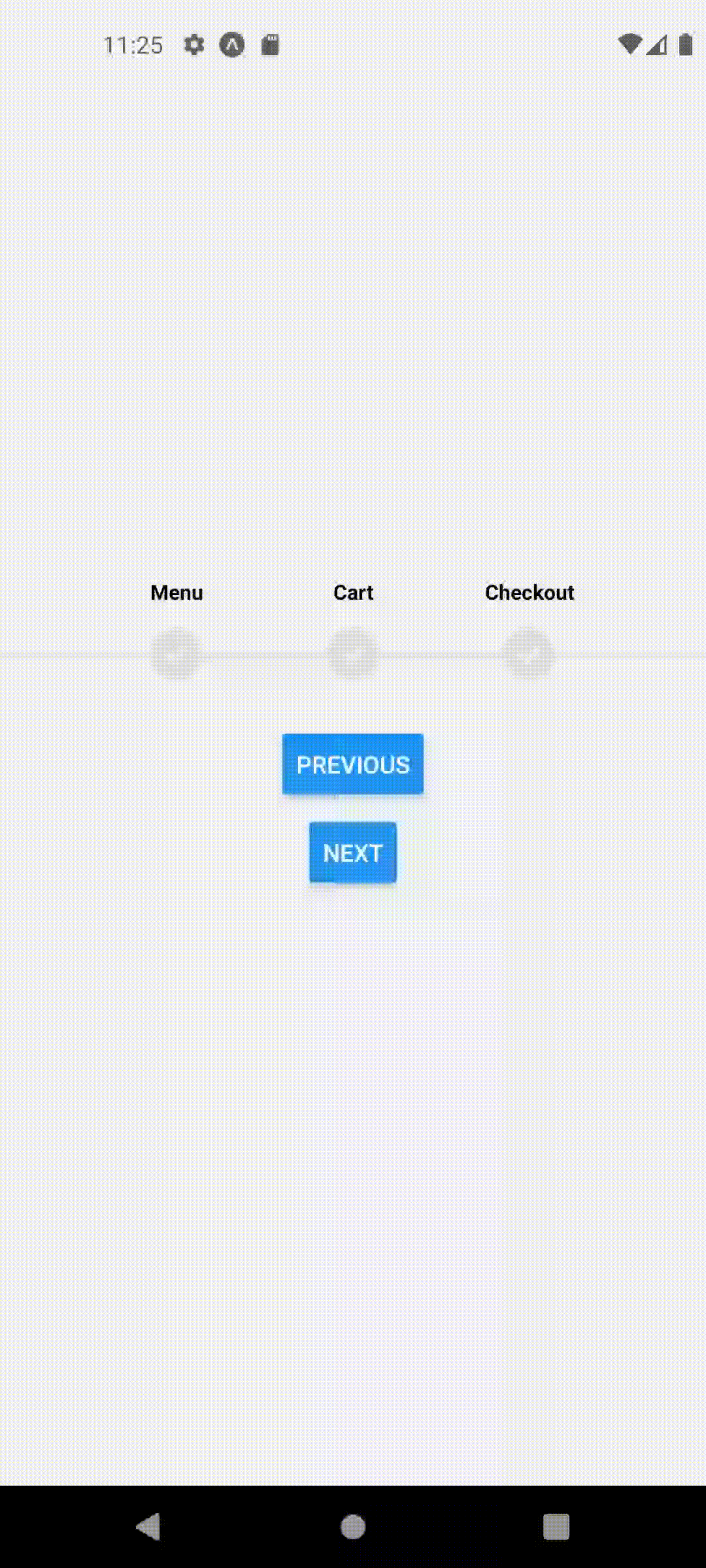
This should produce the following behavior
Props
| Name | Optional | Type | Description | Default Value |
|---|---|---|---|---|
| children | - | React.ReactNode | React components to be rendered as children. | - |
| width | ✓ | number | Width of the progress stepper. | windowWidth - 100. Assuming windowWidth = Dimensions.get('window').width; |
| steps | ✓ | string[] | Array of step labels. | ['Menu', 'Cart', 'Checkout'] |
| initialPosition | ✓ | number | Initial position of the active step. | 0 |
| animationDuration | ✓ | number | Duration of the animation for step transitions. | 300 |
| animationDelay | ✓ | number | Delay before starting the animation. | 700 |
| stepWidth | ✓ | number | Width of each step. | 60 |
| stepStyle | ✓ | ViewStyle | Custom styles for each step. | { width: 30, height: 30, transform: [{ rotate: '45deg' }], borderRadius: 4, justifyContent: 'center', alignItems: 'center' } |
| trackHeight | ✓ | number | Height of the track. | 6 |
| containerHeight | ✓ | number | Height of the container. | 60 |
| activeColor | ✓ | string | Color of the active step. | '#FF0000' |
| inactiveColor | ✓ | string | Color of inactive steps. | '#DEDEDE' |
| showLabels | ✓ | boolean | Whether to display step labels. | true |
| trackActiveColor | ✓ | string | Color of the active track. | activeColor |
| trackInactiveColor | ✓ | string | Color of inactive track. | inactiveColor |
| labelOffset | ✓ | number | Offset for step labels. | -15 |
| labelStyle | ✓ | TextStyle | Custom styles for step labels. | { color: 'black', fontSize: 12, fontWeight: 'bold' } |
| innerLabelStyle | ✓ | TextStyle | Custom styles for inner step labels (if extended is true). | { color: 'white', fontWeight: 'bold', transform: [{ rotate: '-45deg' }] } |
| extended | ✓ | boolean | Indicates if the progress stepper is in extended mode. | false |
| renderInnerStep | ✓ | ((stepLabel: string, stepNumber: number) => React.ReactNode) | Custom function to render inner step content. | null |
Hooks
useProgressStepperContext()
| Property | Type | Description |
|---|---|---|
| currentPosition | number | The current position of the active step within the progress stepper. |
| setCurrentPosition | React.Dispatch<React.SetStateAction<number>> | A function to update the current position of the active step. |
| goToNext | () => void | A function to move to the next step in the progress stepper. |
| goToPrevious | () => void | A function to move to the previous step in the progress stepper. |
| steps | string[] | Array of step labels. |
| width | number | Width of the progress stepper. |
| initialPosition | number | Initial position of the active step. |
| animationDuration | number | Duration of the animation for step transitions. |
| animationDelay | number | Delay before starting the animation. |
| stepStyle | ViewStyle | Custom styles for each step. |
| showLabels | boolean | Whether to display step labels. |
| activeColor | string | Color of the active step. |
| inactiveColor | string | Color of inactive steps. |
| trackHeight | number | Height of the track. |
| containerHeight | number | Height of the container. |
| stepWidth | number | Width of each step. |
| trackActiveColor | string | Color of the active track. |
| trackInactiveColor | string | Color of inactive track. |
| labelOffset | number | Offset for step labels. |
| labelStyle | TextStyle | Custom styles for step labels. |
| innerLabelStyle | TextStyle | Custom styles for inner step labels (if extended is true). |
| extended | boolean | Indicates if the progress stepper is in extended mode. |