ProgresStepperLive
ProgressStepperLive
Usage
ProgressStepperLive is a single page progress stepper component where the main emphasis is showing an ongoing sequence of events.
App.js
import React, { useState } from "react";
import { View, StyleSheet, Button } from "react-native";

import { ProgressStepperLive } from "react-native-reanimated-progress-steps";

function App() {
  const [current, setCurrent] = useState(0);
  return (
    <View style={styles.container}>
      <ProgressStepperLive
        allSteps={["Step 1", "Step 2", "Step3"]}
        showLabels
        stepGap={10}
        trackBackgroundColor="white"
        progressColor="red"
        trackCompletedColor="green"
        currentStep={current}
        animationVariation="live"
        animationDuration={2000}
        trackHeight={8}
      />
      <Button onPress={() => setCurrent(current + 1)} title="Next" />
      <Button onPress={() => setCurrent(current - 1)} title="Prev" />
    </View>
  );
}

export default App;

const styles = StyleSheet.create({
  container: {
    flex: 1,
    justifyContent: "center",
    alignItems: "center",
    gap: 16,
  },
});
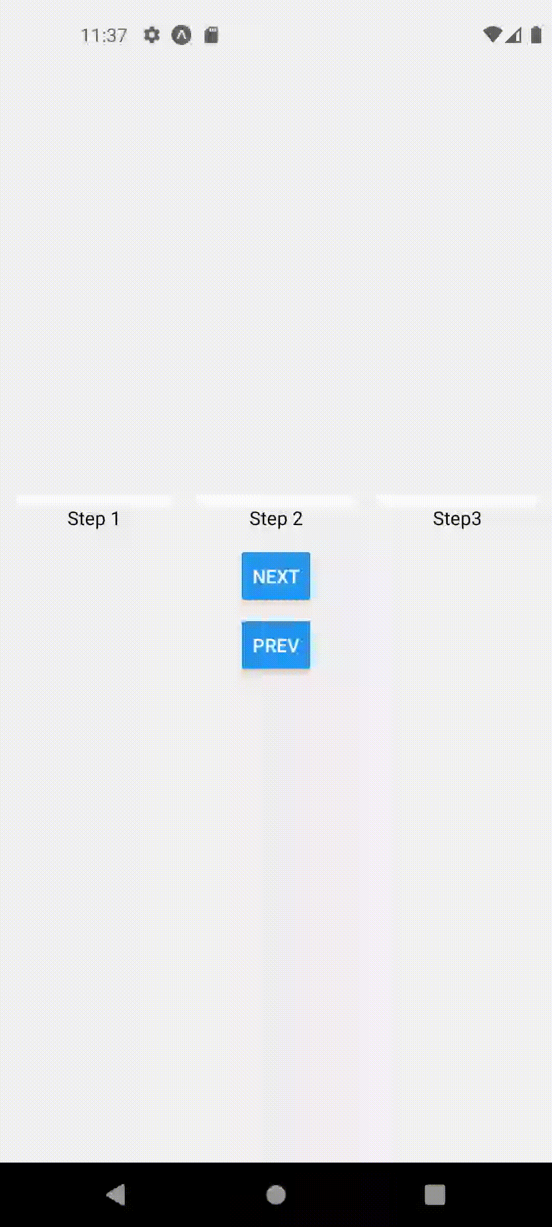
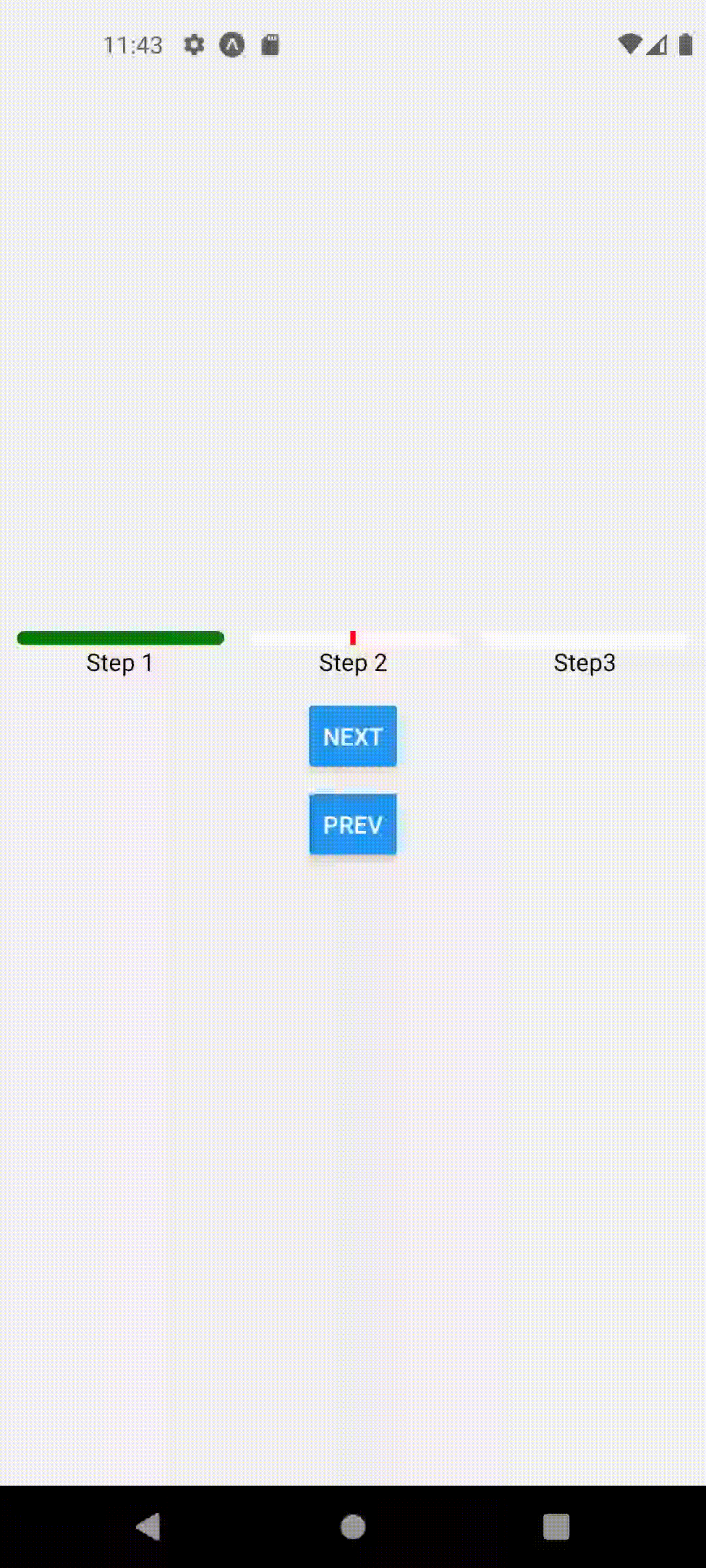
The above code produces the following
Animation Presets
Currently three types of animation variations are supported. animationVariation could be live , scaleToFill or bounce
scaleToFill variation with animationDuration set to 1000
bounce variation with animationDuration set to 500

Props
| Name | Default Value | Description |
|---|---|---|
currentStep | 0 | The current step in the progress stepper. |
allSteps | ['Menu', 'Cart', 'Checkout', 'Delivery'] | An array containing all the steps in the progress stepper. |
showLabels | true | Indicates whether to show labels for each step. |
width | windowWidth - 20 | The overall width of the progress stepper. |
stepGap | 10 | The gap between each step in the progress stepper. |
containerStyle | Style for the container of the progress stepper. | |
trackHeight | 8 | The height of the progress track. |
trackBackgroundColor | '#DEDEDE' | The background color of the progress track. |
progressColor | 'red' | The color of the current progress in the track. |
trackCompletedColor | 'red' | The color of completed progress in the track. |
labelStyle | Style for the labels in the progress stepper. | |
animationVariation | 'scaleToFill' | Type of animation variation, either 'scaleToFill' or 'live'. |
animationDuration | 1000 | Duration of the animation. |