ProgressStepperVertical
ProgressStepperVertical in itself gets all the necessary details from ProgressStepperVerticalProvider. This helps to avoid passing same props to each screen.
In terms of single page usage, it doesn't provide much benefit, but for multi page usage, this keeps the codebase clean.
Use this to simply indicate where the ProgressStepper should appear in a screen.
ProgressStepperVerticalProvider
ProgressStepperVerticalProvider is a Context Provider that holds all of the styles and states of ProgressStepperVertical.
Single Page
Usage
Declare ProgressStepperVerticalProvider in root level to use ProgressStepperVertical and access useProgressStepperVerticalContext hooks
App.js
import {
ProgressStepperVertical,
ProgressStepperVerticalProvider,
useProgressStepperVerticalContext,
} from "react-native-reanimated-progress-steps";
function App() {
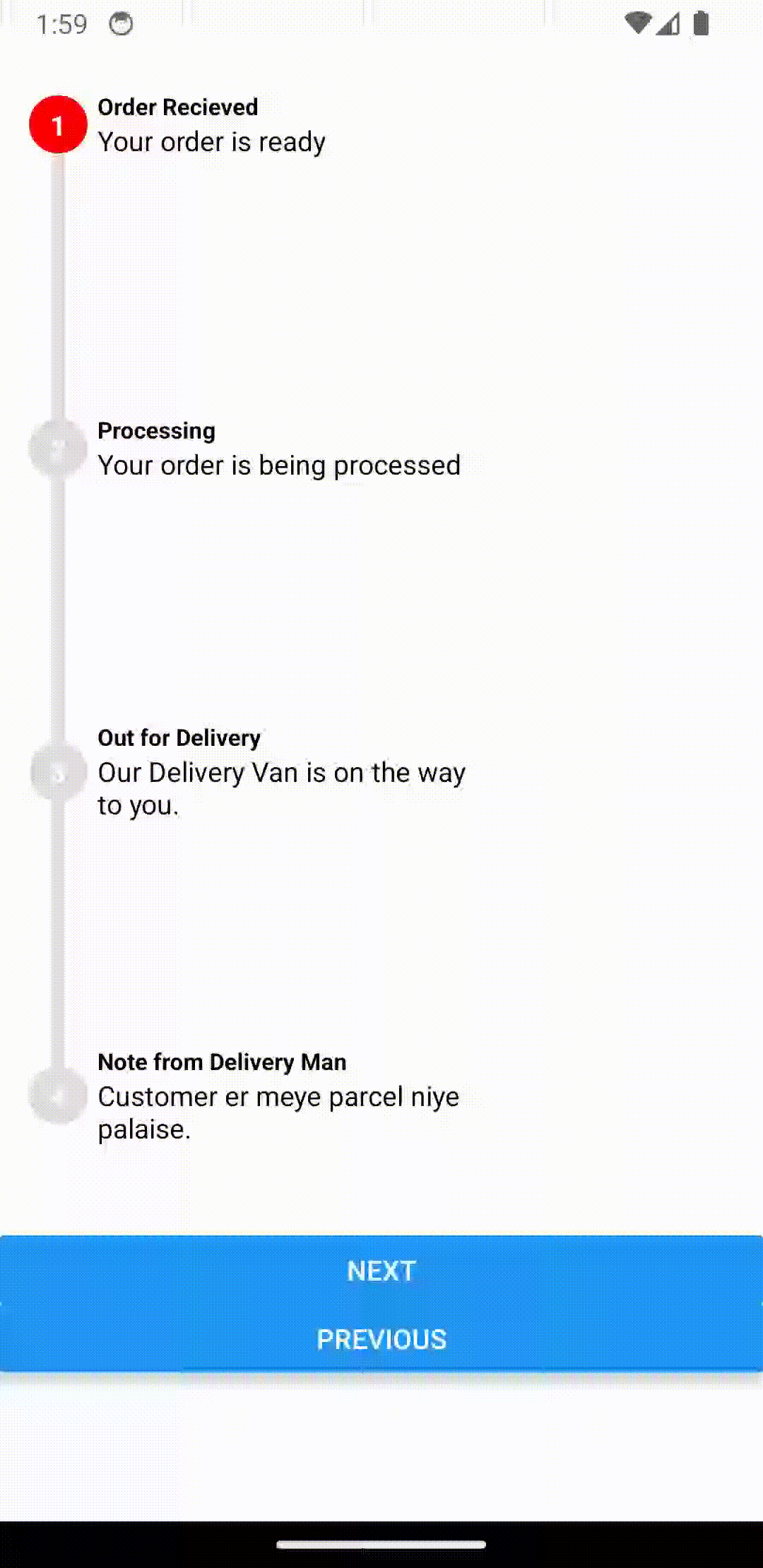
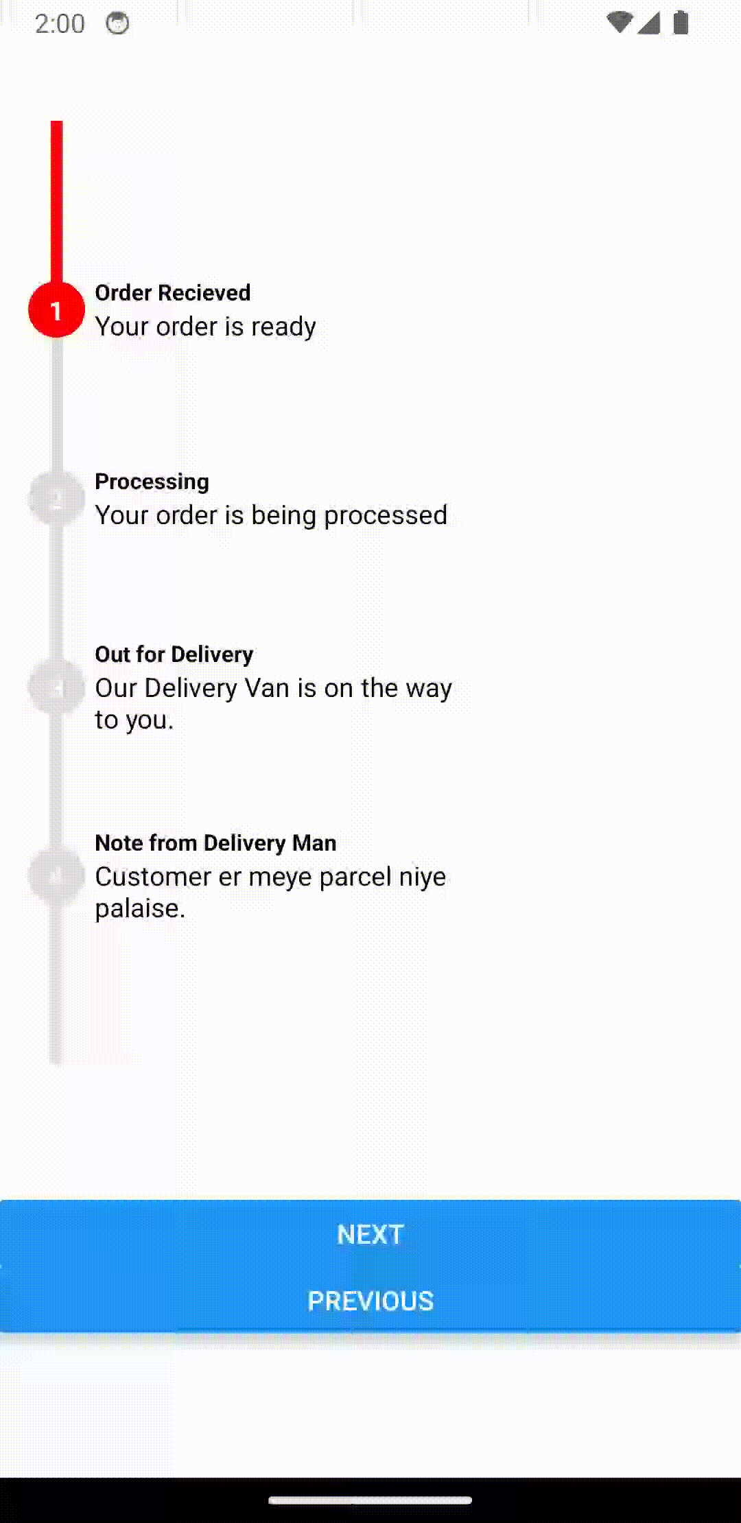
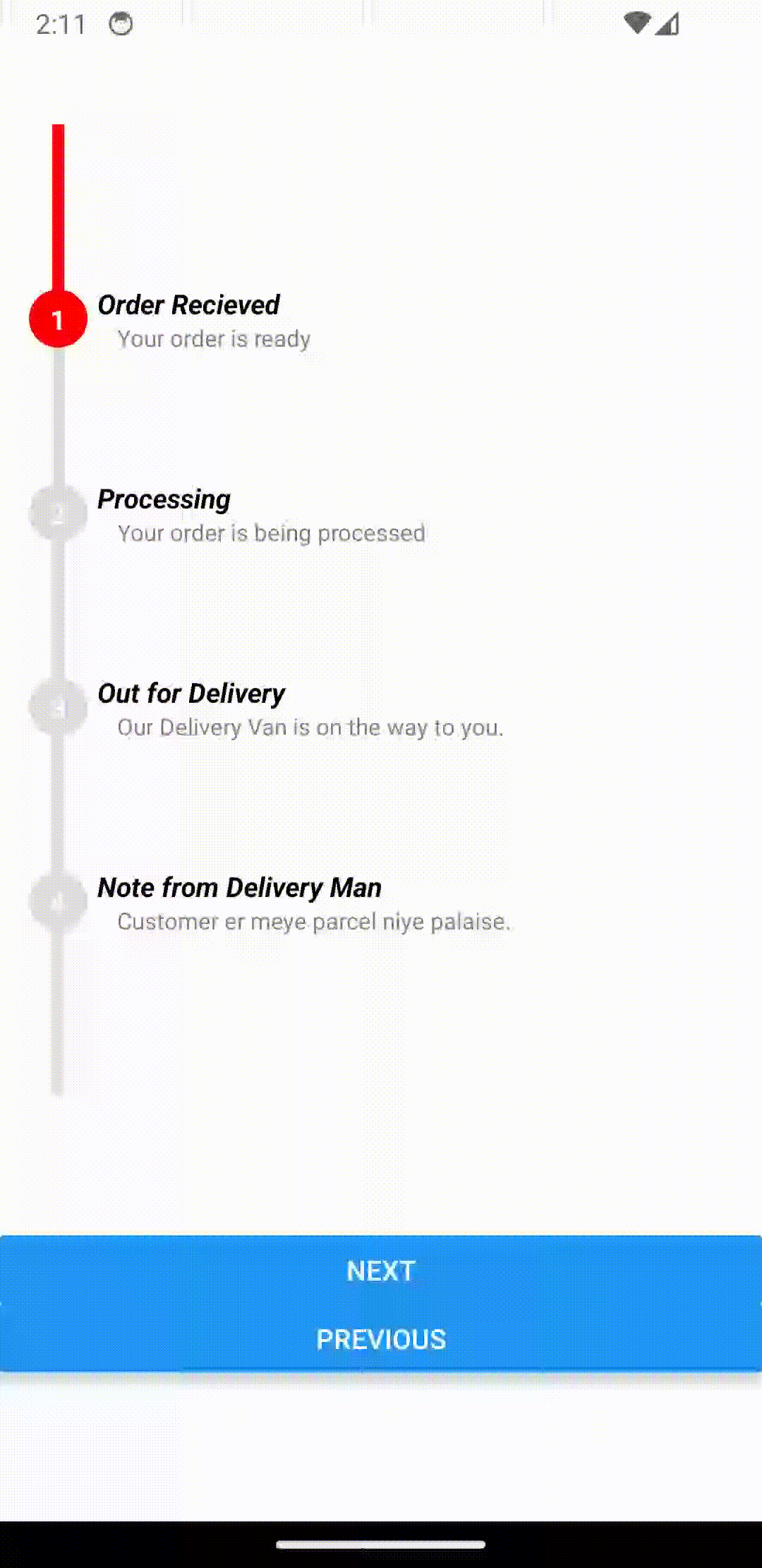
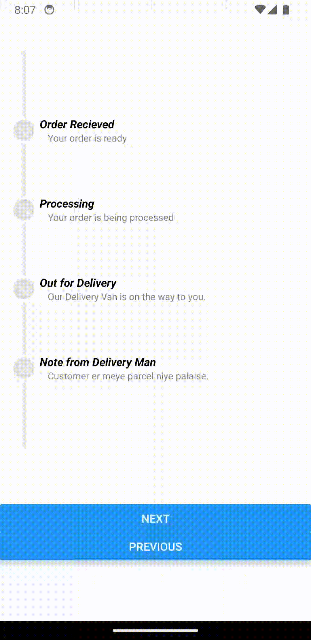
const STEPS = [
{ title: "Order Recieved", description: "Your order is ready " },
{
title: "Processing",
description: "Your order is being processed ",
},
{
title: "Out for Delivery",
description: "Our Delivery Van is on the way to you.",
},
{
title: "Note from Delivery Man",
description: "Customer er meye parcel niye palaise.",
},
];
return (
<SafeAreaView>
<ProgressStepperVerticalProvider
height={500}
steps={STEPS}
initialPosition={1}
>
<ProgressStepperVerticalExample />
</ProgressStepperVerticalProvider>
</SafeAreaView>
);
}
export default App;
ProgressStepperVerticalExample.js
import { View, StyleSheet, Button, ScrollView } from "react-native";

import {
  ProgressStepper,
  useProgressStepperContext,
} from "react-native-reanimated-progress-steps";

function ProgressStepperVerticalExample() {
  const { goToNext, goToPrevious } = useProgressStepperVerticalContext();
  return (
    <ScrollView>
      <View style={styles.container}>
        <ProgressStepperVertical />
      </View>
      <View style={styles.btnContainer}>
        <Button title="Next" onPress={goToNext} />
        <Button title="Previous" onPress={goToPrevious} />
      </View>
    </ScrollView>
  );
}

export default ProgressStepperVerticalExample;

const styles = StyleSheet.create({
  container: {
    marginVertical: 64,
  },
  btnContainer: {
    marginVertical: 2,
  },
});
Default Styles
extended mode
      <ProgressStepperVerticalProvider
        height={500}
        steps={STEPS}
        initialPosition={1}
        extended
      >
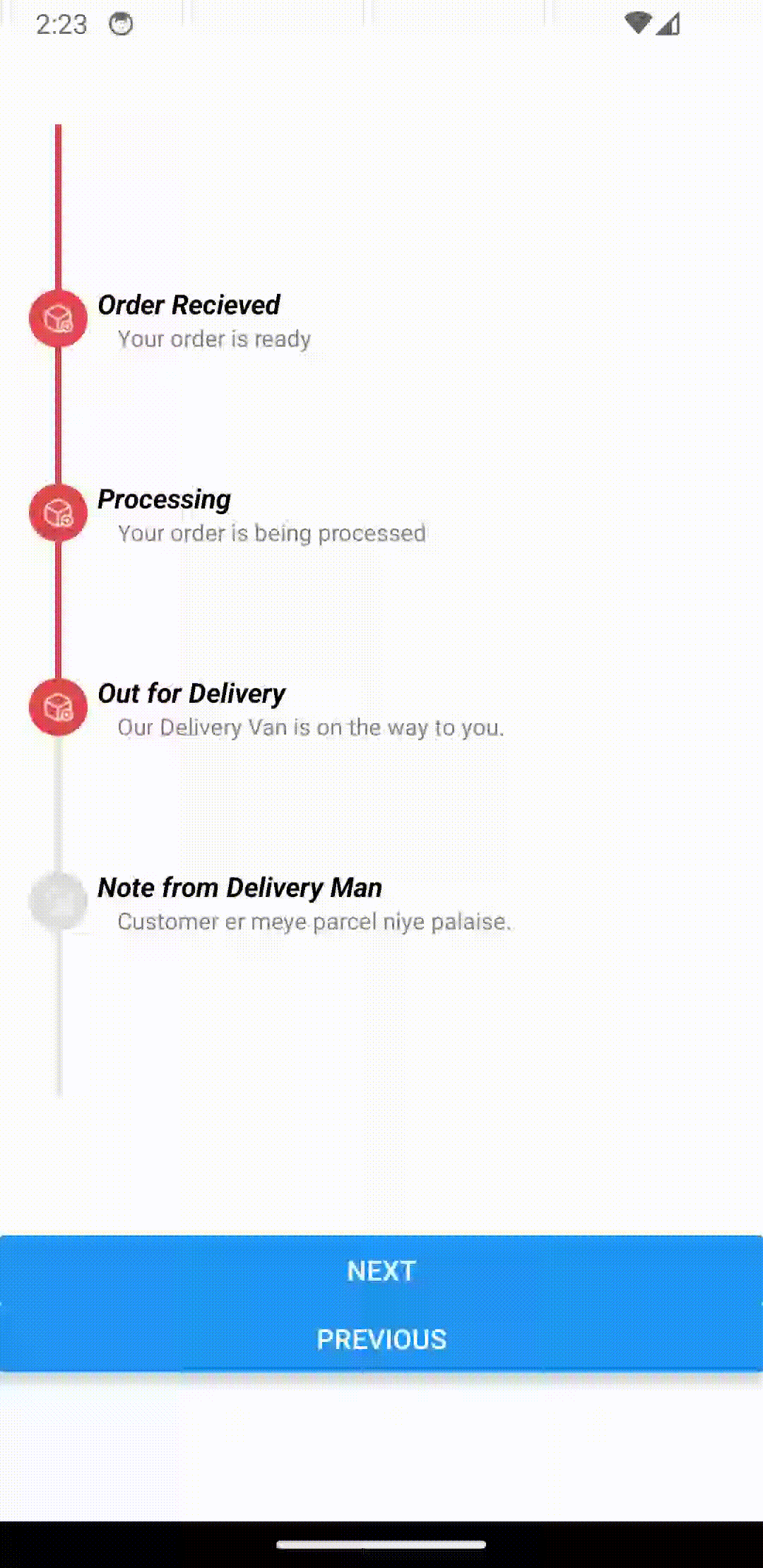
custom step with any valid React Component as step
 <ProgressStepperVerticalProvider
        height={500}
        steps={STEPS}
        initialPosition={1}
        extended
        renderStep={(step, _) => {
          return (
            <View style={styles.stepContainer}>
              <Text style={styles.stepTitle}>{step.title}</Text>
              <Text style={styles.setpDescription}>{step.description}</Text>
            </View>
          );
        }}
      >

 // ...........

const styles = StyleSheet.create({
  stepContainer: {
    width: 300,
  },
  stepTitle: {
    color: 'black',
    fontWeight: 'bold',
    fontStyle: 'italic',
  },
  setpDescription: {
    left: 10,
    color: 'grey',
    fontSize: 12,
  },
});
renderInnerStep to render any valid component as inner step
<ProgressStepperVerticalProvider
        height={500}
        steps={STEPS}
        initialPosition={1}
        extended
        renderStep={(step, _) => {
          return (
            <View style={styles.stepContainer}>
              <Text style={styles.stepTitle}>{step.title}</Text>
              <Text style={styles.setpDescription}>{step.description}</Text>
            </View>
          );
        }}
        renderInnerStep={() => {
          return (
            <Image source={require('../assets/box.png')} style={styles.image} />
          );
        }}
        activeColor="#E44949"
        trackActiveColor="#E44949"
        trackWidth={3}
      >
      //....
      const styles = StyleSheet.create({
        image: {
          width: 16,
          height: 16,
        },
      });
stepStyle to further customize
<ProgressStepperVerticalProvider
        height={500}
        steps={STEPS}
        initialPosition={1}
        extended
        renderStep={(step, _) => {
          return (
            <View style={styles.stepContainer}>
              <Text style={styles.stepTitle}>{step.title}</Text>
              <Text style={styles.setpDescription}>{step.description}</Text>
            </View>
          );
        }}
        renderInnerStep={() => {
          return (
            <Image source={require('../assets/box.png')} style={styles.image} />
          );
        }}
        stepStyle={{
          width: 34,
          height: 34,
          justifyContent: 'center',
          alignItems: 'center',
          borderRadius: 17,
          borderWidth: 4,
          borderColor: 'white',
        }}
        activeColor="#E44949"
        trackActiveColor="#E44949"
        trackWidth={3}
      >
Multi Page
ProgressStepperVertical is ideal for single page use. But it can be used as a multipage setup as well. Just follow the Multi Page Setup Example from ProgressStepper and make sure to replace
ProgressStepperwithProgressStepperVerticalProgressStepperProviderwithProgressStepperVerticalProvideruseProgressStepperContext()withuseProgressStepperVerticalContext()
Props
| Name | Optional | Type | Description | Default Value |
|---|---|---|---|---|
| children | Yes | ReactNode | The children elements to render within the component. | N/A |
| height | Yes | number | The height of the window. | windowHeight |
| steps | Yes | Array | An array containing the steps of the progress indicator. | [] |
| initialPosition | Yes | number | The initial position of the step indicator. | 0 |
| animationDuration | Yes | number | Duration of the step transition animation in milliseconds. | 300 |
| animationDelay | Yes | number | Delay before the animation starts in milliseconds. | 700 |
| trackWidth | Yes | number | Width of the track line. | 6 |
| containerWidth | Yes | number | Width of the container holding the steps. | 60 |
| stepHeight | Yes | number | Height of each step. | 60 |
| stepStyle | Yes | Object | Style object for each step. | { width: 30, height: 30, borderRadius: 15, justifyContent: 'center', alignItems: 'center', position: 'relative' } |
| showLabels | Yes | boolean | Whether to show labels for the steps. | true |
| activeColor | Yes | string | Color of the active step. | #FF0000 |
| inactiveColor | Yes | string | Color of the inactive steps. | #DEDEDE |
| trackActiveColor | Yes | string | Color of the active part of the track. | #FF0000 |
| trackInactiveColor | Yes | string | Color of the inactive part of the track. | #DEDEDE |
| titleContainerStyle | Yes | Object | Style object for the title container. | { left: 50, minWidth: 200 } |
| titleStyle | Yes | Object | Style object for the step title. | { color: 'black', fontSize: 12, fontWeight: 'bold' } |
| descriptionStyle | Yes | Object | Style object for the step description. | {} |
| innerLabelStyle | Yes | Object | Style object for the inner label of each step. | { color: 'white', fontWeight: 'bold' } |
| extended | Yes | boolean | Whether the steps are in extended mode. | false |
| renderInnerStep | Yes | function | Custom rendering function for the inner step. | null |
| renderStep | Yes | function | Custom rendering function for the step. | null |
Hooks
useProgressStepperVerticalContext()
| Property | Type | Description |
|---|---|---|
| height | number | The height of the component. |
| steps | Step[] | An array containing the steps of the progress indicator. |
| initialPosition | number | The initial position of the step indicator. |
| animationDuration | number | Duration of the step transition animation in milliseconds. |
| animationDelay | number | Delay before the animation starts in milliseconds. |
| stepHeight | number | Height of each step. |
| stepStyle | ViewStyle | Style object for each step. |
| trackWidth | number | Width of the track line. |
| containerWidth | number | Width of the container holding the steps. |
| activeColor | string | Color of the active step. |
| inactiveColor | string | Color of the inactive steps. |
| showLabels | boolean | Whether to show labels for the steps. |
| trackActiveColor | string | Color of the active part of the track. |
| trackInactiveColor | string | Color of the inactive part of the track. |
| titleContainerStyle | ViewStyle | Style object for the title container. |
| titleStyle | TextStyle | Style object for the step title. |
| descriptionStyle | TextStyle | Style object for the step description. |
| innerLabelStyle | TextStyle | Style object for the inner label of each step. |
| extended | boolean | Whether the steps are in extended mode. |
| renderInnerStep | ((step: Step, index: number) => React.ReactNode) | Custom rendering function for the inner step. |
| renderStep | ((step: Step, index: number) => React.ReactNode) | Custom rendering function for the step. |
| currentPosition | number | The current position of the step indicator. |
| setCurrentPosition | React.Dispatch<React.SetStateAction<number>> | Function to set the current position of the step indicator. |
| goToNext | () => void | Function to move to the next step. |
| goToPrevious | () => void | Function to move to the previous step. |
| progress | SharedValue<number> | The progress value for the current step. |
| perStepHeight | number | The height for each step when calculating the progress indicator. |